Spatial Graphics: Navigating the Fusion of Graphics and Spatial Design
The relationship between Graphics and Space is one that has long been recognized and explored by professional designers. While many might think of graphic design as primarily dealing with items like illustrations, logos, or packaging, the design dimension goes beyond just two planes. The conception and design of three-dimensional spaces are crucial in crafting effective design solutions.
Throughout history, across diverse cultures, graphical patterns and illustrations have played a pivotal role in architecture and interior spaces. Beyond mere aesthetics, these designs provide layers of cultural significance, stories, and sometimes even functional elements.
Consider the variety of architectural traditions across the world. Many have distinctive patterns and illustrations that narrate tales of their culture, religious beliefs, or historical milestones. Take Islamic architecture, for instance. Its hallmark is often intricate geometric designs combined with elegant calligraphy. Then there’s the ancient Greek architectural style, punctuated by classical motifs, including the iconic meanders or key patterns. It’s noteworthy how different cultures infused specific patterns or symbols in their designs, attributing meanings like prosperity, protection, or virtues such as courage and love. When these motifs and designs find their way into buildings or interiors, they introduce a depth of narrative and resonance to the space.
RELATIONSHIP BETWEEN GRAPHICS & SPACE
Overall, the relationship between graphics and space is symbiotic. While graphics add flair and make environments more engaging and memorable, spaces offer context and purpose for graphic design elements. Together, they craft a holistic visual experience for the viewer.
Graphic design fundamentally revolves around conveying a message. But when tailoring designs for physical (or virtual) spaces, it’s crucial to factor in the setting. This means considering the layout, lighting, and materials at play. Graphics aren’t just about aesthetics; they set the visual order, convey messages in a given space, and cultivate and create a sense of place.
When we talk about a “sense of place,” we’re touching on the deep emotional and cultural ties individuals feel towards specific settings or locations. It’s that innate sense of familiarity or attachment we get in certain spaces. This connection amplifies, especially in residential designs.
To foster this profound connection, it’s all about employing design facets that resonate authenticity. Incorporating specific patterns, colours, typographies, and visual elements that echo the brand, location or culture. By doing so, designers not only makes the space more beautiful but make it resonate deeper with those who interact with it.
Graphic design elements, such as colour, typography, and imagery, can be used to create a consistent and cohesive visual language throughout a space. For example, using a consistent colour palette and typography can help tie together different areas and functionalities, creating a unified and harmonious visual experience for the viewer.

From a commercial point of view, one of the key benefits of considering the relationship between graphic design and space is the ability to create a cohesive brand experience across multiple touchpoints. For example, a retail store may use consistent graphical elements across its packaging, website, and physical store. This creates a solid brand identity that customers can recognize and connect with, leading to increased brand loyalty and recognition.
Another benefit is the ability to create a sense of immersion and engagement. By using graphic elements to create a unique environment, designers can transport customers to a different place and time, creating an emotional connection to the brand or product.
The relationship between graphic design and space also plays an important role in creating a functional and efficient design solution. In a physical and digital spaces, the design must not only be visually appealing but also functional, allowing for easy navigation and accessibility.
WHAT’S SPATIAL GRAPHICS?
Spatial graphics, encompasses the visual elements used within a physical environment to communicate information, create a distinct sense of place, enhance the user experience, and establish an aesthetic or identity. These graphics are integrated into architectural, landscape, and interior spaces to guide, inform, and engage users.
It’s often referred to as environmental graphics, but I prefer not to use that term as it can be confused with the specialization in environmental design.
Spatial graphics can influence inhabitants’ moods and emotions. For instance, certain patterns can be calming, while others can be invigorating. Incorporating colours, nature-inspired patterns or biophilic design can foster well-being and reduce stress. Patterns can be used to either harmonize with the architectural language of a space or introduce a contrasting element.
Graphical patterns can be employed to serve specific functional purposes. For example, patterns on floors can subtly guide movement, while wall patterns can influence perceptions of space — making a space feel cozier or more expansive.
Graphics also introduce visual interest, preventing spaces from feeling monotonous. They can create focal points, hierarchy, establish moods, and evoke specific atmospheres, ranging from serene to vibrant.
It can also play a pivotal role in storytelling, especially in spaces like museums, thematic restaurants, or themed resorts. Graphics can narrate histories, myths, or brand stories.

COMPONENTS & APPLICATIONS OF SPATIAL GRAPHICS
Spatial graphics have different components and applications.
Branding & Identity. It can be employed to reinforce a brand’s identity of a business or institution within a physical space. This might involve the use of logos, brand colours, motifs, and other signature elements within the environment.
Graphics also serve to promote a brand, product, or service within a space.
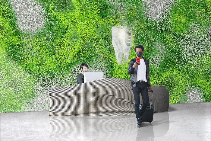
Surface Design. Surface design in spatial graphics pertains to the design and embellishment of surfaces within architectural, environmental spaces and objects. Patterns, textures, colours, or imagery can set the tone and mood of a space.
It can be applied to walls, floors, ceilings, textile, products and furniture. These designs are used to enhance the aesthetics, functionality and experience or to convey specific messages or themes.
Surface design can also delve into exploring different materials — from traditional ones like wood, metal, and fabric to more innovative materials and finishes that can offer unique tactile experiences or visual effects.
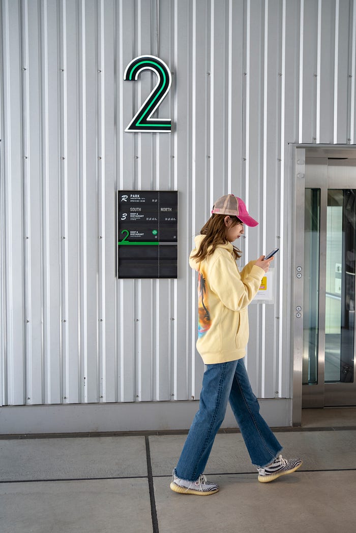
Wayfinding systems. Wayfinding refers to the systems and methods used to guide people through a physical environment and enhance their understanding and experience of the space. This term is most commonly associated to complex built environments such as urban centres, airports, hospitals, campuses, shopping malls, and more.
This might include directional signage, maps, landmark markers, lighting, tactile elements, audio systems and interactive systems. Clear and concise signage can help customers easily locate products or navigate a space, while well-designed product displays can showcase items in an attractive and accessible way.
Regulatory and Safety Signs are an essential part of wayfinding systems, as it ensures that users are aware of rules, regulations, and potential hazards. They might indicate exits, emergency routes, or areas off-limits to the public.
Informational Displays. Provide specific details about the space or its usage, such as interpretive displays in museums, historical sites, or parks.
Interactive Elements. With the rise of technology, surfaces can now be interactive or dynamic, allowing users to engage with them directly. Wall surfaces, for instance, can be designed to change colours, patterns, or display information interactively. Touch-screen kiosks or augmented reality experiences have also become regular players in the space.
EFFECTIVE SPATIAL GRAPHICS USE
Clear & Legible. Spatial graphics should communicate messages swiftly and without confusion.
Integrated. They should feel like a natural part of the environment, enhancing rather than disrupting the user experience.
Accessible. They should cater to all users, including those with disabilities. Consideration should be given to factors like contrast, font size, placement height, and the inclusion of tactile or auditory components.
Consistent. A consistent design language ensures a cohesive experience and reinforces the identity of the space.
CONCLUSION
In essence, spatial graphics blend the principles of graphic design with the three-dimensional nature of spaces to create environments that are not only functional but also emotionally resonant and memorable for users.
Graphical elements bridge the gap between form and function, tangible and intangible, providing layers of meaning, beauty, and utility to architecture and interiors. They help to create an experience that not only communicates a message but also creates a sense of place and emotional connection.
Whether in ancient temples, modern homes, or futuristic commercial spaces, these graphics continue to shape and enrich our spatial experiences.
